EduPlate
An engaging app + marketing website. The app engages and excites children ages 5-10 about nutrition and healthy eating choices; website informs educators/parents/decision makers.
Roles: UX Designer, Brand Designer, UX Researcher
The Challenge
Parents of elementary age children are frustrated by failed attempts to encourage their children to try new foods and eat healthier, well-balanced meals. Elementary school educators required to include nutrition in their curriculum are having trouble keeping the kids excited about and engaged in the content. My goal in designing EduPlate is to create an app that will:
-
Teach children ages 5-10 about nutrition and healthy eating in a way that is fun and engaging for them and encourages them to put these habits into practice.
-
Make said app accessible on multiple devices
-
Provide unique tools for Parents and Educators to manage the app content and preferences.
Discovery
As part of my research for EduPlate, I did a competitive analysis of both direct and indirect competitor apps and websites.
Additionally, interviews were conducted with:
-
Parents of elementary age children
-
Educators of elementary age children
I also studied elementary age children using similar apps and noted their frustrations/pain points as well as areas that were successful with them.
Research Goals
-
What are the processes and emotions that people experience around the problem my product is trying to solve?
-
What accessibility needs may need to be addressed with the product I am trying to create?
Focus on the Users
In order to answer the above questions, I needed to find individuals that could potentially be real users of EduPlate:
-
Children ages 5-10
-
Parents of children ages 5-10
-
Educators of children ages 5-10
Using social media platforms like LinkedIn and Facebook, I put the call out to my direct connections as well as several groups to recruit potential users/interview candidates. My target was to have 9 participants (3 from each category above) respond to a survey. From the data collected in these surveys, I was then able to put together 3 user personas.
User Personas
After organizing the information gained from these interviews, I was able to identify consistent user goals and frustrations and combined with demographics, developed the following user personas.

Maya
Age: 42
Residence: Boulder, Colorado
Occupation: SAHM + part time Pilates Instructor
Education level: BA
Problem Statement: Maya is a full time working mom with 2 elementary age kids who needs a way to encourage her kids to try new foods and understand why that is important because she is tired of making separate meals for her kids because they won’t eat vegetables.
Goal: Get my kids to eat more fresh whole vegetables; find ways to get my kids to enjoy trying new foods & eating a healthier variety of well balanced meals.
Frustrations: Having to make separate meals for the kids and adults; fighting with my kids to get them to eat veggies and try new foods.

Sami
Age: 7
Residence: Denver, CO
Occupation: Elementary School Student
Education level: K-1st grades
Background: Sami is 6 years old. She loves to play games on her tablet but her parents are strict about the amount of time she can spend and the content she can watch. Her parents have said only educational content. Sami is struggling to find apps and games that are educational AND fun for her. Sami is only 6 and has also been diagnosed as dyslexic and therefore text heavy apps and games are difficult and frustrating for her.
Goal: Find apps and/or games on my tablet that are easy and fun and also satisfy her parents rules that it must be educational
Frustrations: Finding apps/games that are age appropriate, educational, fun and also accommodate her reading challenges.

Arturo
Age: 34
Residence: Oakland, CA
Occupation: Elementary School Teacher
Education: BA
Problem Statement: Arturo is an elementary school teacher who needs engaging, fun ways to teach his students about nutrition and healthy eating because It is part of his required teaching curriculum but he is struggling to keep the kids engaged with the materials provided by the school district.
Goal: Ensure my students have an understanding of the importance of food groups, healthy eating, and making good choices in the lunch room.
Frustrations: Not having tools or materials that excite and engage his students in learning about nutrition and healthy eating choices
Competitive Audit
I examined apps appropriate for kids in the 5-10 year age range that are:
-
Educational
-
Focused on nutrition and health
-
Used in classrooms
-
Designed to supplement learning at home
The apps/learning sites reviewed in competitive audit:
-
Khan Academy
-
ABCmouse.com
-
My food, Nutrition for Kids
-
Grow Garden
Identifying Pain Points
I then used insights gained from the competitive audit to help identify user pain points.
-
Lack of venues that offer additional services to streamline planning.
-
Lack of venues that offer a way to ‘self-manage’ events in one central location.
-
A need for a way to plan all details of an event from anywhere without having to meet in person or make multiple
phone calls.
Ideation
As I prepared for the design phase, I wanted to consider, how might we solve these pain points for our users?
-
How might we make it easier for users learn about nutrition?
-
How might we make it fun for users to learn about nutrition?
-
How might we make this product desirable for users to be repeat repeat users/stay engaged and interested?
-
How might we make this product something available to users anytime, anywhere?
-
How might we make this product adapt to all three of our main user groups needs?
-
How might we make this a tool that can be used in the classroom?
-
How might we make this a tool that can be used at home?
Design
Wireframes
Initial wireframes and prototyping focused on mobile devices with the plan to adapt to tablets and pcs. After ideating and drafting some paper wireframes, I created the digital wireframes for the EduPlate app. These focused on delivering personalized guidance to users to help manage their food.


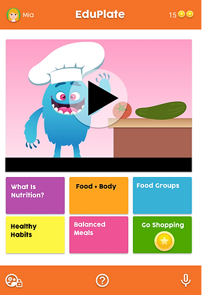
Low Fidelity Prototype
To prepare for usability testing, I created a low-fidelity prototype of the user flow to complete an activity/game titled ‘Build a Plate’. Also accessible are basic Administrator login and pages as well as User Profile.View

Usability Study
-
Study Type: Moderated Usability Study
-
Location: USA, Remote/In-Person
-
Participants: 7
-
Results: After compiling feedback from study participants, three main areas users identified as needing attention.
-
Rewards system - People want a rewards system where there is action/ability to use the rewards as this would be more motivating to continue activities.
-
Accessibility options - Users felt the Build a Plate game would be difficult to play using voice command and needed more transparent indication of how to place foods on the plate.
-
Navigation/user journey - Participants expressed some difficulty in navigating back and forth through the app particularly when playing a game.
-
Mockups
Based on the insights from the usability studies, I applied design changes like putting ‘utility tools all together on the bottom bar, enlarging the User Info on the upper right, and changing the ‘badge’ system to a coin ‘rewards’ system that could be used to purchase items for their avatar”.

Additional design changes included removing the user name etc from above game as this was redundant to the same info located in upper right. A link to go shopping was also swapped for ‘how to use the app’ as this was again a redundancy since the help link is on the bottom navigation bar.

Based on user feedback, to improve accessibility a letter to each section of the plate to make vocal command easier for those who cannot use fingers to drop and drag. Additionally, some participants noted there was no way to move backwards in the navigation, thus a bold ‘go back’ button was added to the design.

User research participants noted there was no means to change the avatar or user info thus an edit icon was added to the avatar. Badges were swapped for coins as users shared that something they could earn to purchase some kind of reward would be more motivating, and thus a direct link to spend the coins is in the user profile now as well.

The original layout of an overlay was demonstrated to be frustrating for some users in our usability study. Some participants felt an auto congratulate that self navigated would be more appealing, and with the switch to coin rewards, a visual demonstration of what they have earned.

Again participants did not like the overlay and extra step to close it. Thus the design was changed to a menu that allowed users options to continue, try something new, or spend their earned rewards coins.

Design System
A design system was also created for the app. I wanted to focus on colors and fonts that were clear, fun, and easy to view.

Results
High Fidelity Prototype
The high-fidelity prototype followed the same user flow as the low-fidelity prototype, including design changes made after the usability study.
Please navigate through the working prototype presented here, created using Figma.
Accessibility Considerations
-
Vocal Command option for users with limited mobility, dyslexia, etc.
-
Large clear images, bright colors with good contrast.
-
Visual cues to make it easier to vocalize how to match foods to plate sections.
Design for Different Use Cases
While I envisioned the app would have the same main purpose on both the tablet - mainly used by children to participate in the activities provided by the app - The website I envisioned as having an additional purpose: Marketing and information to those that would be deciding whether or not to acquire the app, i.e. Parents and Educators.
Responsive Designs
The designs for screen size variation included mobile, tablet, and desktop. I optimized the designs to fit specific user needs of each device and screen size.
.jpg)